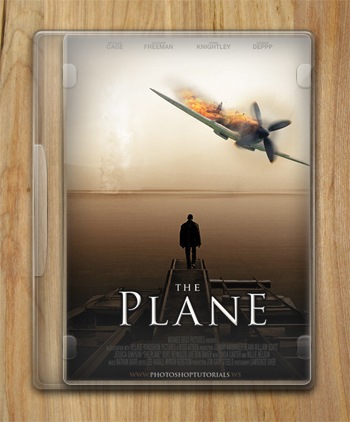
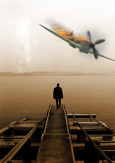
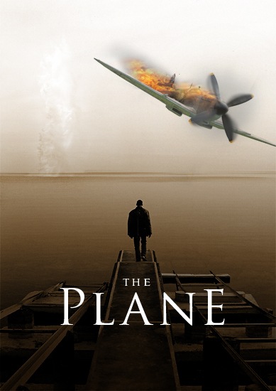
[postlink]http://testlifepsd.blogspot.com/2010/03/manipulating-ww2-fighter-aircraft.html[/postlink]In this tutorial we will be learning some indispensable techniques to use for any type of photo-manipulation. We will be doing this by taking a photograph of a model plane and editing it to to look like a photograph of a WW2 spitfire which has just been shot down and is on fire. The techniques used here are the same for any type of 'destruction' photo-manipulation. Below is the image you will learn how to create. In the second part of this tutorial we will go on to use this image in a movie poster/DVD cover design.
![22[8] 22[8]](http://photoshoptutorials.ws/images/stories/22%5B8%5D_bea4ad69-801e-4eda-a6c1-4fd376bcb069.jpg)
![1[4] 1[4]](http://photoshoptutorials.ws/images/stories/1%5B4%5D_3a1efa85-8a0e-43cd-8bbe-f227ab944a07.jpg)
![2[4] 2[4]](http://photoshoptutorials.ws/images/stories/2%5B4%5D_8b5da581-bf8b-400b-a0eb-85db42768559.jpg)
![3[4] 3[4]](http://photoshoptutorials.ws/images/stories/3%5B4%5D_c5dcc60b-c137-414a-ab4d-f65b2d22919d.jpg)
![4[4] 4[4]](http://photoshoptutorials.ws/images/stories/4%5B4%5D_35a714ba-fa8e-44f4-891e-de51aeb1c0c6.jpg)
![5[4] 5[4]](http://photoshoptutorials.ws/images/stories/5%5B4%5D_b5e2e521-4d6a-4254-88c5-7a43b974a663.jpg)
![6[4] 6[4]](http://photoshoptutorials.ws/images/stories/6%5B4%5D_bf2401c0-a234-4b9a-82bb-e1f28a484584.jpg)
![7[4] 7[4]](http://photoshoptutorials.ws/images/stories/7%5B4%5D_97b6c3dc-776d-46f7-b7dd-30f6c0c96d60.jpg)
![8[4] 8[4]](http://photoshoptutorials.ws/images/stories/8%5B4%5D_9a8be939-c021-494d-a79d-356fed52e18c.jpg)
![9[4] 9[4]](http://photoshoptutorials.ws/images/stories/9%5B4%5D_3c476c33-260d-4a1a-9583-17212dae4208.jpg)
![10[4] 10[4]](http://photoshoptutorials.ws/images/stories/10%5B4%5D_084607fb-aebd-46a5-91b2-9fb1c546e897.jpg)
![11[4] 11[4]](http://photoshoptutorials.ws/images/stories/11%5B4%5D_80e07feb-9d60-47b8-b1e6-469e75708fa4.jpg)
![12[4] 12[4]](http://photoshoptutorials.ws/images/stories/12%5B4%5D_c5f3fbf8-8832-4a98-9982-ff386c624400.jpg)
![13[4] 13[4]](http://photoshoptutorials.ws/images/stories/13%5B4%5D_efc2d2c3-1300-493e-9d6f-61086733b95f.jpg)
![14[4] 14[4]](http://photoshoptutorials.ws/images/stories/14%5B4%5D_8b3c79d2-a3a2-4cf9-bcbe-dfd258446a19.jpg)
![15[4] 15[4]](http://photoshoptutorials.ws/images/stories/15%5B4%5D_c96799df-d35c-4a69-b7c9-3234c9fe6f44.jpg)
![16[4] 16[4]](http://photoshoptutorials.ws/images/stories/16%5B4%5D_8e2d36a2-2b2a-450d-be9e-3c4f3bd4ba31.jpg)
![17[4] 17[4]](http://photoshoptutorials.ws/images/stories/17%5B4%5D_d46a93a3-98fc-482c-a061-3b0ab1bc7b97.jpg)
![18[4] 18[4]](http://photoshoptutorials.ws/images/stories/18%5B4%5D_f43492d4-66f4-452b-a5e2-aa5044d644e8.jpg)
![19[4] 19[4]](http://photoshoptutorials.ws/images/stories/19%5B4%5D_015c05e0-6be7-4913-b209-6523912a5545.jpg)
![20[4] 20[4]](http://photoshoptutorials.ws/images/stories/20%5B4%5D_73442237-cc45-4a91-b678-38087c374255.jpg)
![21[4] 21[4]](http://photoshoptutorials.ws/images/stories/21%5B4%5D_c53bc5b9-2f42-4e3e-86c7-abf068f5976a.jpg)
![22[9] 22[9]](http://photoshoptutorials.ws/images/stories/22%5B9%5D_eb6d6fba-95e3-4ff3-a6cc-11cf09dc3bc3.jpg)
Preview of Final Results
![22[8] 22[8]](http://photoshoptutorials.ws/images/stories/22%5B8%5D_bea4ad69-801e-4eda-a6c1-4fd376bcb069.jpg)
Manipulating a WW2 Fighter Aircraft Photoshop Tutorial
Step 1
Create a new document with dimensions; 550x400px then go here and copy this image then paste it into your document and scale and move it until you're happy with it then change the blend mode of this layer to multiply.![1[4] 1[4]](http://photoshoptutorials.ws/images/stories/1%5B4%5D_3a1efa85-8a0e-43cd-8bbe-f227ab944a07.jpg)
Step 2
We are going to add some noise to the plane because at the moment it looks a bit too clean and unrealistic. Create a new layer above the plane then go Filter>Noise>Add Noise and use a value of 50% and check uniform and monochromatic.![2[4] 2[4]](http://photoshoptutorials.ws/images/stories/2%5B4%5D_8b5da581-bf8b-400b-a0eb-85db42768559.jpg)
Step 3
Set this layer to 40% opacity and change the blend mode to soft light then Alt+click between the noise layer and the plane in the layers panel to add a clipping mask.![3[4] 3[4]](http://photoshoptutorials.ws/images/stories/3%5B4%5D_c5dcc60b-c137-414a-ab4d-f65b2d22919d.jpg)
Step 4
Since this is an image of a model plane then the propellers are obviously not moving so we're going to make them move in Photoshop; to do this we first have to make a copy of the plane then extract the propeller. First hold Alt and drag the plane layer above the noise layer, this will duplicate the layer but not break the clipping mask. Now hide the original plane layer then select the new plane layer and add a layer mask by pressing the layer mask button in the bottom of the layers panel. Now select the brush tool and choose a hard round brush, change the foreground color to black and start painting around the propeller; the parts that you paint on will be hidden. GO round the propeller and change the size of the brush regularly to suit the part you are working on. Keep at it until you have something like this and don't worry about being accurate here it wont really matter as long you have the basic shape.![4[4] 4[4]](http://photoshoptutorials.ws/images/stories/4%5B4%5D_35a714ba-fa8e-44f4-891e-de51aeb1c0c6.jpg)
Step 5
Duplicate this layer then right click on the layer mask and select 'Apply Layer Mask'. Select the smudge tool and choose a brush with 0% hardness andd a size of about 60px then change the strength to 50%. None blade at a time, just drag from the blade anti-clockwise slightly a few times to give the smudged effect shown below.![5[4] 5[4]](http://photoshoptutorials.ws/images/stories/5%5B4%5D_b5e2e521-4d6a-4254-88c5-7a43b974a663.jpg)
Step 6
Repeat step 5 but this time drag out a bit further then change the opacity of this layer to 50%.![6[4] 6[4]](http://photoshoptutorials.ws/images/stories/6%5B4%5D_bf2401c0-a234-4b9a-82bb-e1f28a484584.jpg)
Step 7
We're going to make make it look even more like its spinning as well as adding some smoke at the same time. Create a new layer then select the brush tool and with a 0% hardness brush with a diameter of about 10px draw two rough circles one in black and one in the same color as the tip of the blades.![7[4] 7[4]](http://photoshoptutorials.ws/images/stories/7%5B4%5D_97b6c3dc-776d-46f7-b7dd-30f6c0c96d60.jpg)
Step 8
We now need to blur this so go Filter>Blur>Gaussian Blur and use a value of 20px and you should get something similar to this.![8[4] 8[4]](http://photoshoptutorials.ws/images/stories/8%5B4%5D_9a8be939-c021-494d-a79d-356fed52e18c.jpg)
Step 9
We'll take a look at where we've got to so far, we've added the noise first to make it look a bit dirtier then we isolated the propeller and and smudged it to look like its moving. Isolating parts of an image is a really important technique to start using as you'll often need to edit parts of a stock image and it's often much easier to isolate the parts whether you want to blur the part, alter some colors or change the shape and size of it. Lastly we just used a quick and simple way to add some more motion by quickly drawing a circle then heavily blurring it. Now just turn the visibility of the original plane back on and you should have something looking like this.![9[4] 9[4]](http://photoshoptutorials.ws/images/stories/9%5B4%5D_3c476c33-260d-4a1a-9583-17212dae4208.jpg)
Step 10
In the next few steps we will be adding some burn marks, flame and smoke so we need a really good stock image to use for this, The one I use all the time for this kind of thing can be found here. I've shown what it looks like below and you'll notice that it's perfect for this kind of thing; it has flames, burn marks, smoke and even bits of debris. First paste this image into your document and scale it down to roughly your document size.![10[4] 10[4]](http://photoshoptutorials.ws/images/stories/10%5B4%5D_084607fb-aebd-46a5-91b2-9fb1c546e897.jpg)
Step 11
Basically now we're going to copy part of this image onto the side of the plane, the easiest way to do this is to first duplicate the layer with the van in it then hide the original van layer. Now either use the eraser tool or the lasso tool to remove all except the the front corner of the van with burn marks, just do this roughly then rotate and scale this layer and place it over the plane like so, I used a soft eraser brush just to remove the hard edges.![11[4] 11[4]](http://photoshoptutorials.ws/images/stories/11%5B4%5D_80e07feb-9d60-47b8-b1e6-469e75708fa4.jpg)
Step 12
Now click the layer mask button in the layers panel to add a mask to this layer. Now select the brush tool and choose a soft round brush then change the foreground color to black then in the main toolbar change the opacity to 20%. We want to get rid of most of the flames here so do this by brushing over them (make sure you are working on the mask not the layer). As well as brushing over the flames we also want to hide some parts that are a bit too harsh or generally don't look right.![12[4] 12[4]](http://photoshoptutorials.ws/images/stories/12%5B4%5D_c5f3fbf8-8832-4a98-9982-ff386c624400.jpg)
Step 13
You'll have noticed that some parts of this layer run over the wing or outside the plane, to fix this you have to change the brush to about 85% hardness and an opacity of 100% then brush over the wings and around the plane. Use the image below for reference.![13[4] 13[4]](http://photoshoptutorials.ws/images/stories/13%5B4%5D_efc2d2c3-1300-493e-9d6f-61086733b95f.jpg)
Step 14
We're going to add in some smoke now so create a new layer then select the brush tool and choose a 50px round brush with 0% hardness and an opacity of 10%. With the foreground color set to black, brush some smoke onto this layer; the best way to do this is to click continually rather than dragging. Try and get something that resembles the image below.![14[4] 14[4]](http://photoshoptutorials.ws/images/stories/14%5B4%5D_8b3c79d2-a3a2-4cf9-bcbe-dfd258446a19.jpg)
Step 15
Now we're going to make it look like the tail is burning and we are going to do this in the same way as we did to put the burn marks on the plane. First duplicate the van layer again and drag the duplicated layer to the top of the layer stack then get rid of the parts you don't want. Then place this layer over the wing, it doesn't matter what part of the image you use as long is it looks like burning metal.![15[4] 15[4]](http://photoshoptutorials.ws/images/stories/15%5B4%5D_c96799df-d35c-4a69-b7c9-3234c9fe6f44.jpg)
Step 16
Now add a layer mask then with a hard black brush at full opacity, hide the parts that go outside the wing so this layer should now be the same shape as the wing. Next change the blend mode to hard light, you can experiment with some other blend modes if you want here.![16[4] 16[4]](http://photoshoptutorials.ws/images/stories/16%5B4%5D_8e2d36a2-2b2a-450d-be9e-3c4f3bd4ba31.jpg)
Step 17
Now to actually add the flame, again we do this in the same way so duplicate the van layer, drag it to the top of the layer stack then find a good flame (I liked the one just above the tire) then hide some of the other parts and soften the edges. Now rotate and scale it to get the flame in the right position like so.![17[4] 17[4]](http://photoshoptutorials.ws/images/stories/17%5B4%5D_d46a93a3-98fc-482c-a061-3b0ab1bc7b97.jpg)
Step 18
Add a layer mask to this layer then with a soft brush at varying opacities hide all the parts except the flame and also brush away parts of the flame to shape it slightly. Lastly, with a hard round brush at full opacity, brush over the wing so the flame doesn't look like it comes in front of the wing. Make sure the edges of the flames aren't too hard or it will look unrealistic.![18[4] 18[4]](http://photoshoptutorials.ws/images/stories/18%5B4%5D_f43492d4-66f4-452b-a5e2-aa5044d644e8.jpg)
Step 19
I wanted add a flame coming from the propeller, this had to be less visible as I figured the propeller would probably dissipate the flame. You should be able to work out how to do this but I'll go over how I did it. First duplicate the flame layer then drag it above the propeller then go Edit>Transform>Warp and shape the flame a bit like so. Note that I've hidden the back flame in the images below just so you can see this flame more clearly.![19[4] 19[4]](http://photoshoptutorials.ws/images/stories/19%5B4%5D_015c05e0-6be7-4913-b209-6523912a5545.jpg)
Step 20
Add a layer mask and soften this flame a lot by brushing over it with a soft black brush at a medium opacity until you get something similar to the image below.![20[4] 20[4]](http://photoshoptutorials.ws/images/stories/20%5B4%5D_73442237-cc45-4a91-b678-38087c374255.jpg)
Step 21
That's as far as I'm going to take you but there's a lot further you can go, a few ideas to try would be to make it look like one of the blades are on fire or to add some falling debris or even break one of the wings.![21[4] 21[4]](http://photoshoptutorials.ws/images/stories/21%5B4%5D_c53bc5b9-2f42-4e3e-86c7-abf068f5976a.jpg)
Step 22
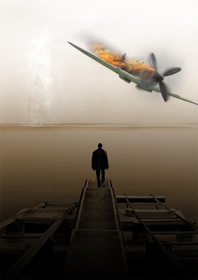
The last thing I did was to add a simple background this can be any image of a sky, however the image has to be fairly light because we have the plane layer set at overlay, this was so we didn't need to remove the white background from it but it does limit us to placing the plane over a light background. If you want to use this on a darker background then you would have to extract the plane which isn't all that hard as it is on a white background anyway. Hopefully you learned some skills that you can transfer to other projects and have fun setting things on fire and generally destroying stuff.![22[9] 22[9]](http://photoshoptutorials.ws/images/stories/22%5B9%5D_eb6d6fba-95e3-4ff3-a6cc-11cf09dc3bc3.jpg)
source: photoshoptutorials.ws
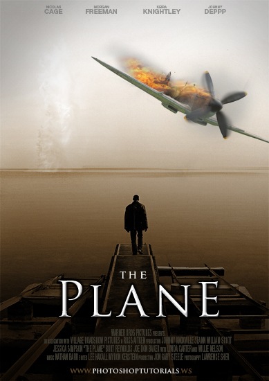
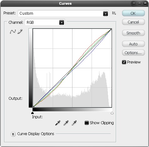
![17[1] 17[1]](http://photoshoptutorials.ws/images/stories/17%5B1%5D_f3030d54-6bfe-444d-94bb-956a50f803c8.jpg)
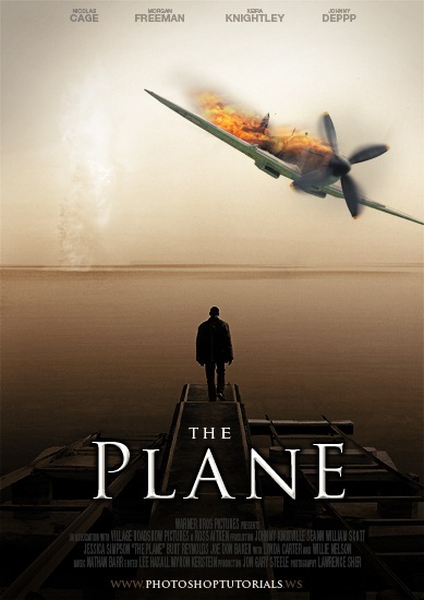
![20[1] 20[1]](http://photoshoptutorials.ws/images/stories/20%5B1%5D_8c152009-7942-4c8e-a701-2ae482c49657.jpg)
